|
Displaying the art
Topics: Hanging 2D Art Displaying 3D Art Lighting Making Labels Displaying Artist Statements Creating Gallery Books 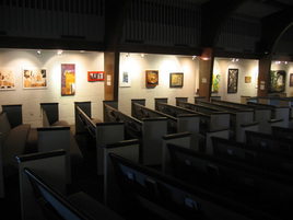 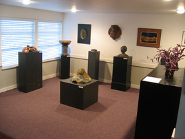 |
The process of hanging an exhibit includes several steps. We don’t need every step for the smaller exhibits that rotate throough the year, but the Arts Festival exhibits require a lot of organization since we get many more entries for them. Here's what we may do:
Hanging 2D Art For a long time we had to hang art directly on the cinderblock walls of the sanctuary and on sheetrock in other rooms. We found concrete hangers that worked well, but they did tend to pull out some of the block when we removed them. Of course, drywall hangers leave holes and sometimes pull paint off the wall. So a lot of our hanging time was actually repairing the walls after the exhibits. Finally, we raised funds for a real hanging system. Happy, happy, joy, joy! We purchased the Walker system, which consists of a rail that mounts near the ceiling, rods of varying lengths, and hangers that screw onto the rods. The system has handled even very heavy works without failing. It was easy to install and is easy to use. But knowing how to hang the art is only the first step. Where to hang each piece is the real challenge. I can honestly say that we have had supernatural help for every exhibit. So here's our process. Three or four of us line up the 2D art along the front pews so we can see it all. Then we pray together. We then choose two works to hang on opposite walls at the spots in our space that are two natural focal points. We want these pieces to be physically large and artistically strong, to "anchor" each wall. Next we start lining the works up against the two walls. We consider colors, frame style, size, media, boldness of the image, and artistic effectiveness as we move them here and there, stopping to stand back and contemplate. When we agree that it feels right, up they go. I wish I could give you some rules to follow, but I have found that hanging is as much of an art as painting or drawing. It is like composing a collage. Displaying 3D Art Three-dimensional work is always a challenge to display. First, the size and type of work varies so much – books, jewelry, sculpture, furniture, costumes, for example. Ideally, each would get a special case or pedestal, but these are expensive and hard to store between exhibits. We have used music stands and tables with cloth coverings. Professional 3D artists generally provide their own pedestals or cases, and we have asked all our 3D artists to help figure out how to display their work. The second challenge is how to protect the art. One solution, when we have only two or three sculptures, has been to place pedestals in corners where they are not likely to get bumped. When we have more pieces to show, we have put all of them together in one area, an alcove that has only one way in or out and therefore is never a hallway. The mass of them all in one place seems to provide some protection. |
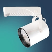 Our fixtures look similar to this |
Lighting
Nothing brings art to life like good lighting. Our lighting system was by far the most expensive item HopeArts ever bought and by far the most valuable. First, you have to buy the track to mount on the ceiling, then each fixture, and finally each bulb. As I recall, one fixture with bulb cost about $75 ten years ago, so it took a period of years to collect all the fixtures we needed. The good news is that we have never replaced a bulb. Choosing the right bulb is confusing. Different bulbs emit different colors of light. Some are spotlights and some are floodlights. We didn't figure this out at first, so we have some greenish and some pinkish lights, some spots and some floods. I still am no expert on lighting; just know that there are many options, so try to find someone at your local lighting supply to help you navigate your purchase. |
 Example of a wall label |
Making Labels
The information that goes on a label is usually the artist’s name, the title of the work, and the medium used. We print the text at 12- to 14-point type and make the title bold. Label styles go in and out of fashion. When we started, we printed them on label paper, stuck the paper on matboard, and cut the the labels apart with a guillotine papercutter. Advantage: The labels are sturdy. Disadvantage: It is hard to cut them all evenly and straight. We have also tried printing on plain paper and mounting on adhesive-backed Fome-Core. Advantage: The labels are lightweight and easy to stick to the wall. Disadvantage: Fome-Core crumples easily and can be tricky to cut – you need a straight-edge and a sharp X-Acto knife over a cutting surface. Some galleries print onto transparent label "paper." Advantage: The labels stick to the wall without additional adhesive. Disadvantage: The wall color and texture shows through, which may make the wording hard to read. Another way to label is to stick adhesive numbers next to the art and provide a gallery list as a key. Advantages: It is easier to format a list than labels, and you can buy prenumbered stickers. Disadvantage: It is less convenient for viewers to find information about each artwork. We then mount the labels near the bottom right side of the work. The only adhesive we have found that works on our cinderblock walls is "blue stuff" – various companies make mounting putties. We use DAP BlueStik. Our source is the local teacher supply store. |
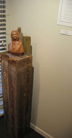 Label and artists statement are on the wall |
Displaying Artist Statements
We require artist statements for most exhibits. A thoughtful statement provides insight into an artist’s purpose, motivations, relationship to the materials s/he works with, and influences. We feel, and our experience has confirmed, that the statements really help both the artists and the viewers. Artists are forced to think more deeply about their process and intentions, and this helps viewers connect with the art and therefore with the artist. We do limit the length of artist statements and will edit them if necessary. Most of our exhibits have multiple artists, and therefore we mount a statement next to each piece of art. A wall full of long statements would daunt all but the most determined viewer, as well as take up a lot of space. We print statements in a readable text font at 12 points on standard-size paper with at least an inch margin all around the text. We mount it on Fome-Core or matboard and trim it if the statement doesn’t take up the whole page (we hope it doesn't!). Creating Gallery Books For the Arts Festival exhibits, we also print gallery books, which are three-ring binders containing a note from the arts pastor, a list of all the works, and all the artist statements. We place these where viewers can easily find them. The list of works includes the price of each work (or NFS, not for sale) and where it is located, since we have art in several rooms. We don't handle sales so we also include contact information for the artists.
|


Hope and the Visual Arts by Kate Van Dyke is licensed under a Creative Commons Attribution-NonCommercial-NoDerivs 3.0 Unported License.
Based on a work at www.hopeva.weebly.com.
Permissions beyond the scope of this license may be available at http://www.hopeva.weebly.com.
